Categories
- Architecture
- Art & Illustration
- Blog
- Business
- Company
- Corporate
- Culture
- Design Agencies
- Designer
- Developer
- E-Commerce
- Education
- Entertainment
- Events
- Experimental
- Fashion
- Film & TV
- Finance
- Food & Drink
- Games
- Health
- Hotel & Restaurant
- Institutions
- Lifestyle
- Magazine
- Mobile & Apps
- Music & Sound
- Newspaper
- Organization
- Other
- Personal
- Photography
- Portfolio
- Promotional
- Real Estate
- Resource
- Social
- Sports
- Startups
- Technology
- Themes
- Web & Interactive
- Web Designer
- Web Developer
Tags
- Animation
- App Style
- Background Images
- Bootstrap
- Bright
- Canvas
- Carousel
- Clean
- Colorful
- Design
- Drupal
- Fixed Navigation
- Flat Design
- Fluid
- Fullscreen
- Gallery
- Graphic design
- Grid
- Horizontal Layout
- Icons
- Illustration
- Infinite Scroll
- Interaction
- Interaction Design
- Menu - Horizontal
- Menu - Vertical
- Minimal
- One Page
- Parallax
- Photo & Video
- Photography
- Portfolio
- Responsive
- Responsive Design
- Retro
- Scrolling
- SEO
- Social Integration
- Sound-Audio
- Storytelling
- SVG
- Texture
- Transitions
- Typography
- UI design
- Vector
- Video
- Web Fonts
- WooCommerce
- WordPress
ADMA Group
by
Marina Lebedeva
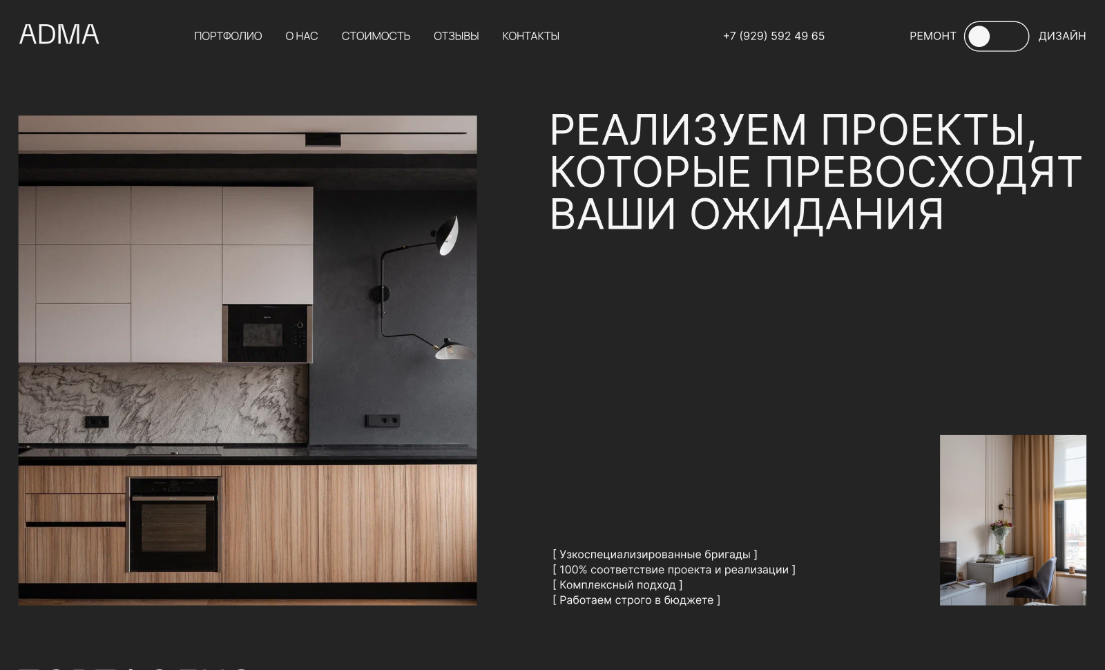
from GeorgiaWebsite of the company, which is engaged in major repairs. Minimalistic dark site. The emphasis is on showing the company's work, the site is a lot of real photos of the company's projects.
8.83
Final Judge's Score
8.83
Design
8.83
Usability
8.83
Development
Hemaxikunvarba Gohil
Web designer - UI/UX designer
9Design
9Usability
9Development
9.00Overall
Ravi G
CEO - 9brainz
8Design
8Usability
8Development
8.00Overall
Ekaterina Diakova
Web Designer
9Design
8Usability
9Development
8.67Overall
Marina Lebedeva
Web Designer
10Design
10Usability
10Development
10.00Overall
Ashish Kachrola
Founder - Ak Web Designer
8Design
8Usability
8Development
8.00Overall
Alina Kotylevskaya
Web Designer - Kotylevskaya Webdesign
9Design
9Usability
9Development
9.00Overall
Alika Keldibekova
Web Designer
8Design
8Usability
8Development
8.00Overall
Anna Kalyuzhnaya
Web Designer
9Design
10Usability
9Development
9.33Overall
Anastasia Kozyreva
Web Designer
10Design
10Usability
10Development
10.00Overall
Szilveszter Vecsei
Sr. Software Developer - wesztyweb
8Design
8Usability
9Development
8.33Overall
Julia Kostina
Web Designer - JK Web Design
9Design
9Usability
9Development
9.00Overall
Elena Rogozhkina
Web Designer
9Design
9Usability
8Development
8.67Overall


