







Categories
- AI
- Architecture
- Art & Illustration
- Blog
- Business
- Company
- Corporate
- Culture
- Design Agencies
- Designer
- Developer
- E-Commerce
- Education
- Entertainment
- Events
- Experimental
- Fashion
- Film & TV
- Finance
- Food & Drink
- Games
- Health
- Hotel & Restaurant
- Institutions
- Lifestyle
- Magazine
- Mobile & Apps
- Music & Sound
- Newspaper
- Organization
- Other
- Personal
- Photography
- Portfolio
- Promotional
- Real Estate
- Resource
- SaaS Tool
- Social
- Sports
- Startups
- Technology
- Themes
- Web & Interactive
- Web Designer
- Web Developer
Tags
- AEO
- Animation
- App Style
- Background Images
- Bootstrap
- Bright
- Canvas
- Carousel
- Clean
- Colorful
- Design
- Drupal
- Fixed Navigation
- Flat Design
- Fluid
- Fullscreen
- Gallery
- Graphic design
- Grid
- Horizontal Layout
- Icons
- Illustration
- Infinite Scroll
- Interaction
- Interaction Design
- Menu - Horizontal
- Menu - Vertical
- Minimal
- One Page
- Parallax
- Photo & Video
- Photography
- Portfolio
- Responsive
- Responsive Design
- Retro
- Scrolling
- SEO
- Social Integration
- Sound-Audio
- Storytelling
- SVG
- Texture
- Transitions
- Typography
- UI design
- Vector
- Video
- Web Fonts
- WooCommerce
- WordPress
Property One
Max Bekasov
from Russia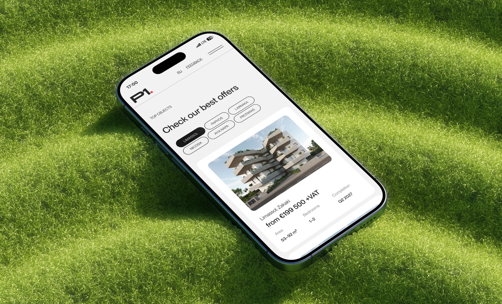
Here is a website for a real estate agency in Cyprus — it’s about visual clarity and rhythm. Laconism here is not about the absence of details, but about a strict system: typography sets the hierarchy, margins create “breathability,” and the grid maintains the structure across all screens. The bilingual version (Russian/English) maintains visual balance: text lengths are taken into account, line spacing and type sizes are adjusted so that both languages look organic. The city-based catalog and service pages are built using uniform modules: the user can easily understand the logic, even if they’re seeing the site for the first time. Each block answers a single question — without unnecessary words or visual clutter. This approach makes the interface not only aesthetically pleasing but also functional: the user quickly finds what they need and moves confidently through the flow.
Final Judge's Score
Design
Usability
Development


Alyona Lillo
Web Designer



Dmitrii Morudo
Web Designer


Anastasia Nikolaeva
Web Designer

Sara Kushkova
Designer & Art Director

Shikhar Mangla
Product Design Lead - Sling TV

Yana Kuznetsova
Web & Digital Designer

Mardji Ramus
Web Designer

Lingjie Guo
UX/UI designer - Synopsys

Layla Zhan
Art Director - PlantsZoo


Darya Kovaleva
Web Designer


Property One
needs your vote.
Design - 1/3
Can engage the users with considered colors, typography and imagery?
-
1-4Not good enough
-
5It's ok
-
6Good
-
7Very Good
-
8Great
-
9Excellent
-
10Perfect
Only Pro User