


Categories
- Architecture
- Art & Illustration
- Blog
- Business
- Company
- Corporate
- Culture
- Design Agencies
- Designer
- Developer
- E-Commerce
- Education
- Entertainment
- Events
- Experimental
- Fashion
- Film & TV
- Finance
- Food & Drink
- Games
- Health
- Hotel & Restaurant
- Institutions
- Lifestyle
- Magazine
- Mobile & Apps
- Music & Sound
- Newspaper
- Organization
- Other
- Personal
- Photography
- Portfolio
- Promotional
- Real Estate
- Resource
- Social
- Sports
- Startups
- Technology
- Themes
- Web & Interactive
- Web Designer
- Web Developer
Tags
- Animation
- App Style
- Background Images
- Bootstrap
- Bright
- Canvas
- Carousel
- Clean
- Colorful
- Design
- Drupal
- Fixed Navigation
- Flat Design
- Fluid
- Fullscreen
- Gallery
- Graphic design
- Grid
- Horizontal Layout
- Icons
- Illustration
- Infinite Scroll
- Interaction
- Interaction Design
- Menu - Horizontal
- Menu - Vertical
- Minimal
- One Page
- Parallax
- Photo & Video
- Photography
- Portfolio
- Responsive
- Responsive Design
- Retro
- Scrolling
- SEO
- Social Integration
- Sound-Audio
- Storytelling
- SVG
- Texture
- Transitions
- Typography
- UI design
- Vector
- Video
- Web Fonts
- WooCommerce
- WordPress
PORTMAN
NETNAJEM
from Polska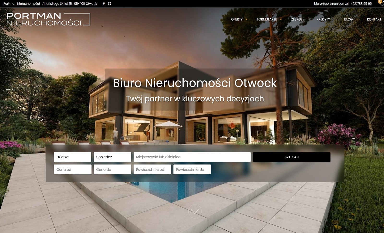
Crafting a digital presence for a premium real estate brand requires more than just listing properties; it demands an environment that reflects the substance, aspiration, and trust inherent in the transaction. Our collaboration with PORTMAN, a distinguished real estate agency in Poland, was founded on this very principle. We set out to build a website that is not merely a catalog, but a seamless extension of their brand values: permanence, luxury, and deep local expertise. The design philosophy is rooted in architectural clarity and sophisticated minimalism. We employed a robust, serif typeface for headings to convey stability and tradition, paired with clean, open sans-serif text for flawless readability—a visual metaphor for PORTMAN's blend of established reliability and modern service. The color palette is intentionally restrained, drawing from a sophisticated spectrum of deep charcoals, warm ivories, and muted golds, evoking the timeless elegance of well-crafted buildings and the premium nature of their portfolio. Beyond its static beauty, the website is engineered for performance and emotional connection. High-resolution, cinematic photography and subtle parallax scrolling create a sense of depth and immersion, allowing potential investors to truly envision a life within these Polish properties. The user interface is meticulously clean and intuitive, with intelligent filtering that effortlessly guides users from a broad search to their perfect property. For a local audience, we integrated seamless Polish language functionality with a design that feels both globally sophisticated and distinctly native, building immediate trust. The PORTMAN website is a testament to how strategic, beautiful design doesn't just showcase properties—it builds an unshakable foundation of confidence and desire.
Final Judge's Score
Design
Usability
Development

Ekaterina Zvereva
Web Designer

Mariia Bocharnikova
Web Designer


Minzhou Wang
UI/UX Designer - Husqvarna Professional Products Inc.


Elena Kukina
Web Designer


Yuliya Desiatova
Web & UI/UX Designer


Maria Tavakalova
UI/UX & Web Designer
PORTMAN
needs your vote.
Design - 1/3
Can engage the users with considered colors, typography and imagery?
-
1-4Not good enough
-
5It's ok
-
6Good
-
7Very Good
-
8Great
-
9Excellent
-
10Perfect
Only Pro User