Categories
- Architecture
- Art & Illustration
- Blog
- Business
- Company
- Corporate
- Culture
- Design Agencies
- Designer
- Developer
- E-Commerce
- Education
- Entertainment
- Events
- Experimental
- Fashion
- Film & TV
- Finance
- Food & Drink
- Games
- Health
- Hotel & Restaurant
- Institutions
- Lifestyle
- Magazine
- Mobile & Apps
- Music & Sound
- Newspaper
- Organization
- Other
- Personal
- Photography
- Portfolio
- Promotional
- Real Estate
- Resource
- Social
- Sports
- Startups
- Technology
- Themes
- Web & Interactive
- Web Designer
- Web Developer
Tags
- Animation
- App Style
- Background Images
- Bootstrap
- Bright
- Canvas
- Carousel
- Clean
- Colorful
- Design
- Drupal
- Fixed Navigation
- Flat Design
- Fluid
- Fullscreen
- Gallery
- Graphic design
- Grid
- Horizontal Layout
- Icons
- Illustration
- Infinite Scroll
- Interaction
- Interaction Design
- Menu - Horizontal
- Menu - Vertical
- Minimal
- One Page
- Parallax
- Photo & Video
- Photography
- Portfolio
- Responsive
- Responsive Design
- Retro
- Scrolling
- SEO
- Social Integration
- Sound-Audio
- Storytelling
- SVG
- Texture
- Transitions
- Typography
- UI design
- Vector
- Video
- Web Fonts
- WooCommerce
- WordPress
Edina
Lorena Pastor
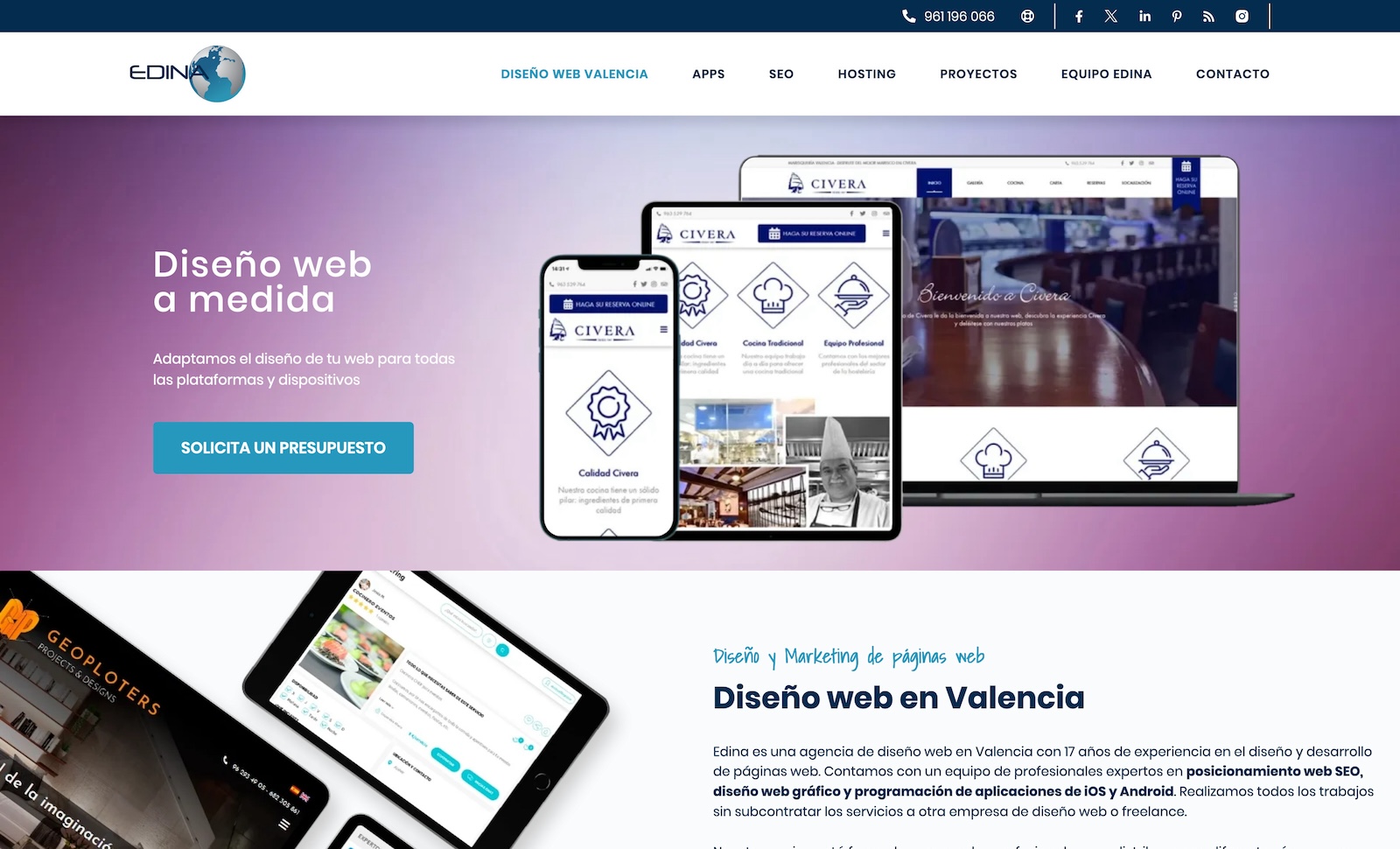
from SpainThe web design of the "Edina" agency, developed by Lorena Pastor, stands out with a stylish and minimalist approach, giving the website a modern and appealing look. The primary color scheme consists of light tones that impart a sense of lightness and airiness to the interface. The main page of the website impresses with its elegance and clear structure. Clean lines and simple forms create a feeling of space and order. The navigation is intuitively understandable, ensuring user-friendly experience. Lorena Pastor carefully approached the selection and distribution of fonts to ensure readability and harmony in the textual part. Interface elements, such as buttons and icons, are executed in a consistent style, creating a unified and recognizable design. The agency's portfolio is presented in the form of a gallery with clear images of projects. This section allows visitors to easily browse through the works, emphasizing the professionalism and quality of services provided by the agency. Special attention is given to the adaptability of the design for various devices. The site remains beautiful and functional both on computers and mobile devices, providing a pleasant viewing experience regardless of the platform. Overall, Lorena Pastor's design for the "Edina" agency's website combines modernity, minimalism, and functionality, creating an attractive visual perception for visitors and emphasizing the professional status of the company.
Final Judge's Score


