Categories
- Architecture
- Art & Illustration
- Blog
- Business
- Company
- Corporate
- Culture
- Design Agencies
- Designer
- Developer
- E-Commerce
- Education
- Entertainment
- Events
- Experimental
- Fashion
- Film & TV
- Finance
- Food & Drink
- Games
- Health
- Hotel & Restaurant
- Institutions
- Lifestyle
- Magazine
- Mobile & Apps
- Music & Sound
- Newspaper
- Organization
- Other
- Personal
- Photography
- Portfolio
- Promotional
- Real Estate
- Resource
- Social
- Sports
- Startups
- Technology
- Themes
- Web & Interactive
- Web Designer
- Web Developer
Tags
- Animation
- App Style
- Background Images
- Bootstrap
- Bright
- Canvas
- Carousel
- Clean
- Colorful
- Design
- Drupal
- Fixed Navigation
- Flat Design
- Fluid
- Fullscreen
- Gallery
- Graphic design
- Grid
- Horizontal Layout
- Icons
- Illustration
- Infinite Scroll
- Interaction
- Interaction Design
- Menu - Horizontal
- Menu - Vertical
- Minimal
- One Page
- Parallax
- Photo & Video
- Photography
- Portfolio
- Responsive
- Responsive Design
- Retro
- Scrolling
- SEO
- Social Integration
- Sound-Audio
- Storytelling
- SVG
- Texture
- Transitions
- Typography
- UI design
- Vector
- Video
- Web Fonts
- WooCommerce
- WordPress
Sushi Restaurant
by
Dammannica
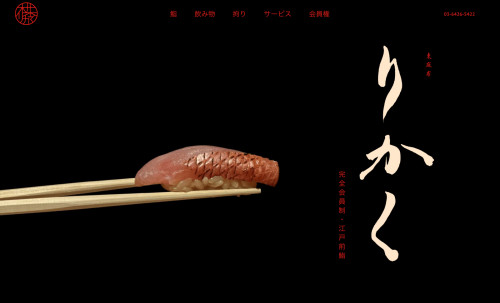
from JapanRikaku, a prestigious Tokyo sushi spot, has a website featuring dark, sophisticated tones with a bright accent, capturing the place's vibe. Quality content and animation grab attention, evoking a desire to visit.
7.11
Final Judge's Score
7.00
Design
7.33
Usability
7.00
Development
Julia Kostina
Web Designer - JK Web Design
8Design
8Usability
8Development
8.00Overall
Olesia Linich
Web Designer
7Design
7Usability
7Development
7.00Overall
Katrin Golobotovskaya
Web Designer
7Design
7Usability
6Development
6.67Overall
Vasilisa Vasilkova Klim
Web Designer
6Design
7Usability
7Development
6.67Overall
Alexandra Romanenko
Web Designer
7Design
7Usability
7Development
7.00Overall
Ruslan Mametanov
Web Designer
7Design
8Usability
7Development
7.33Overall


