Categories
- Architecture
- Art & Illustration
- Blog
- Business
- Company
- Corporate
- Culture
- Design Agencies
- Designer
- Developer
- E-Commerce
- Education
- Entertainment
- Events
- Experimental
- Fashion
- Film & TV
- Finance
- Food & Drink
- Games
- Health
- Hotel & Restaurant
- Institutions
- Lifestyle
- Magazine
- Mobile & Apps
- Music & Sound
- Newspaper
- Organization
- Other
- Personal
- Photography
- Portfolio
- Promotional
- Real Estate
- Resource
- Social
- Sports
- Startups
- Technology
- Themes
- Web & Interactive
- Web Designer
- Web Developer
Tags
- Animation
- App Style
- Background Images
- Bootstrap
- Bright
- Canvas
- Carousel
- Clean
- Colorful
- Design
- Drupal
- Fixed Navigation
- Flat Design
- Fluid
- Fullscreen
- Gallery
- Graphic design
- Grid
- Horizontal Layout
- Icons
- Illustration
- Infinite Scroll
- Interaction
- Interaction Design
- Menu - Horizontal
- Menu - Vertical
- Minimal
- One Page
- Parallax
- Photo & Video
- Photography
- Portfolio
- Responsive
- Responsive Design
- Retro
- Scrolling
- SEO
- Social Integration
- Sound-Audio
- Storytelling
- SVG
- Texture
- Transitions
- Typography
- UI design
- Vector
- Video
- Web Fonts
- WooCommerce
- WordPress
Good Web Studio
by
Good Web Studio
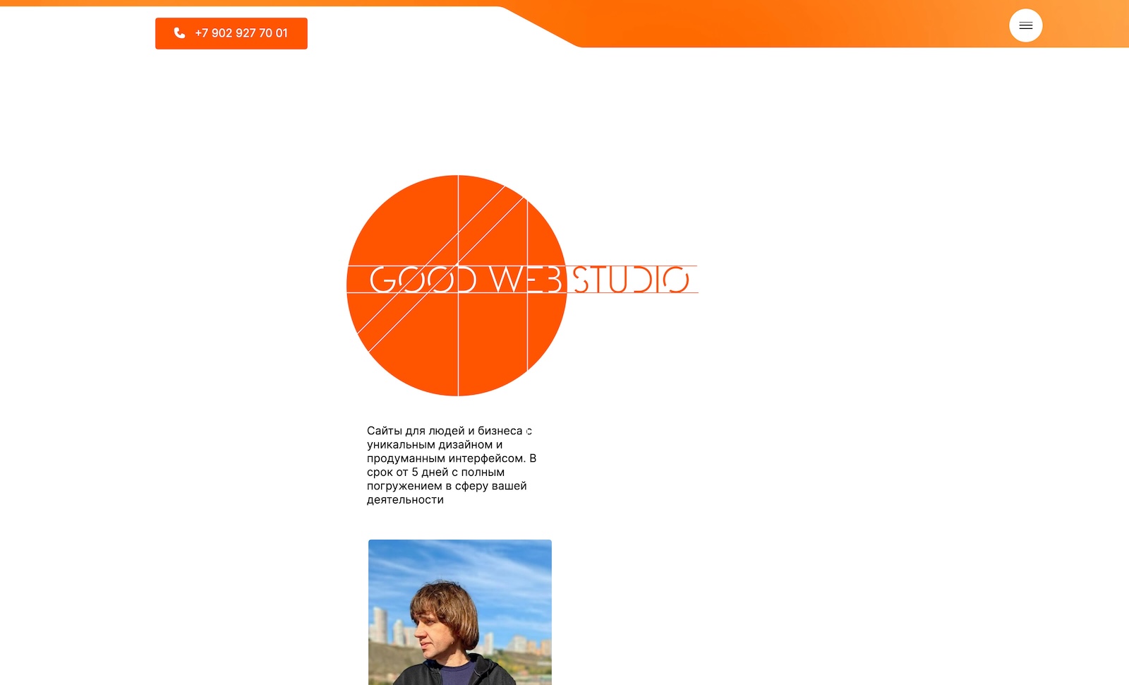
from RussiaThe redesign of the studio's website was made just a couple of days ago. I tried to make it light, sometimes mischievous due to the elements of the handwritten font
8.96
Final Judge's Score
8.83
Design
9.00
Usability
9.06
Development
Iuliia Kalmykova
Web Designer
8Design
8Usability
8Development
8.00Overall
Vladimir Kovalchuk
Web Designer
10Design
10Usability
10Development
10.00Overall
Szilveszter Vecsei
Sr. Software Developer - wesztyweb
4Design
5Usability
5Development
4.67Overall
Anna Kalyuzhnaya
Web Designer
7Design
8Usability
8Development
7.67Overall
Catrina Catunic
Product Designer
10Design
10Usability
10Development
10.00Overall
Julia Kostina
Web Designer - JK Web Design
10Design
10Usability
10Development
10.00Overall
Olga Eganyan
Web Designer
7Design
7Usability
8Development
7.33Overall
Anastasia Kozyreva
Web Designer
10Design
10Usability
10Development
10.00Overall
Alexandra Romanenko
Web Designer
10Design
10Usability
10Development
10.00Overall
Irina Demchenko
Web Designer
10Design
10Usability
10Development
10.00Overall
Venera Murzabayeva
UI/UX Designer - Vinny Designer
7Design
8Usability
8Development
7.67Overall
Ashish Kachrola
Founder - Ak Web Designer
7Design
7Usability
7Development
7.00Overall
Valeria Vostrokonova
Web Designer
10Design
10Usability
10Development
10.00Overall
Olga Ionova
UI/UX Designer
10Design
10Usability
10Development
10.00Overall
Vasilisa Vasilkova Klim
Web Designer
9Design
9Usability
9Development
9.00Overall
Irina Khachatryan
Web Designer
10Design
10Usability
10Development
10.00Overall
Aleksandr Groshev
Web Designer
10Design
10Usability
10Development
10.00Overall
Vitaliy Samoylov
Web Designer
10Design
10Usability
10Development
10.00Overall


